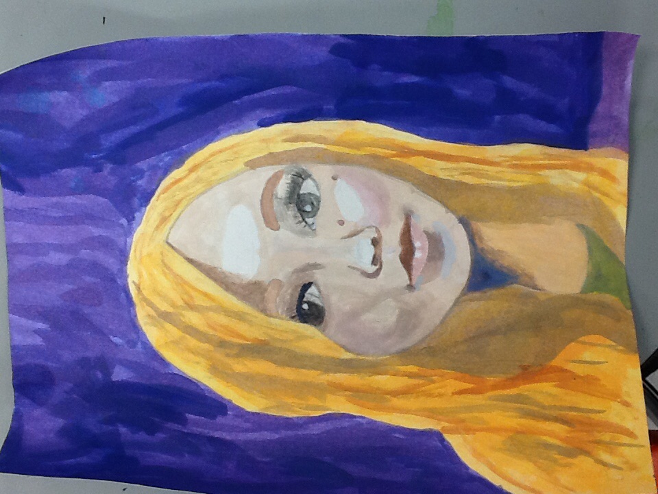
This is my self portrait painting. I learned a lot while sketching and painting this, mainly that some things have to be darker or lighter, and i was hesitant to paint certain shadows as dark as they actually are but it's what makes the painting realistic. I emphasized highlights and used complimentary colors to make this picture pop. I am really proud of how it turned out even though it could have been better, it was one of my first times using water colors in a realistic way, so I think I did pretty well.
 RSS Feed